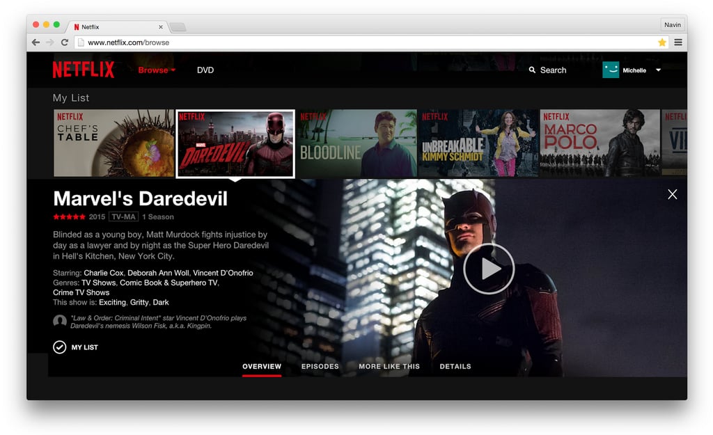
Get ready for a more enhanced Netflix that may actually ease the pain of trying to decide what to watch next. The company announced a new user experience and redesign to its website [1] that's been four years in the making.
The website's look is now more heavily focused toward tablet and mobile device users, removing the clunky ways Netflix used to work, like constantly going to a new page whenever you clicked on a show or movie. Instead, you can now "hover your mouse over a title" and see different images. You can now also click on a title or synopsis and an "Inline details" page will open, which includes an overview, episodes, trailers, details, and a "More Like This" tab. The "More Like This" tab is great news for anyone who's looking to watch a new show or movie based on its similarity to an old favorite. Examples of what these features look like in action are here:
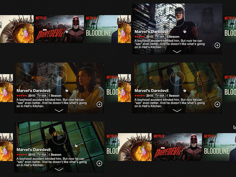
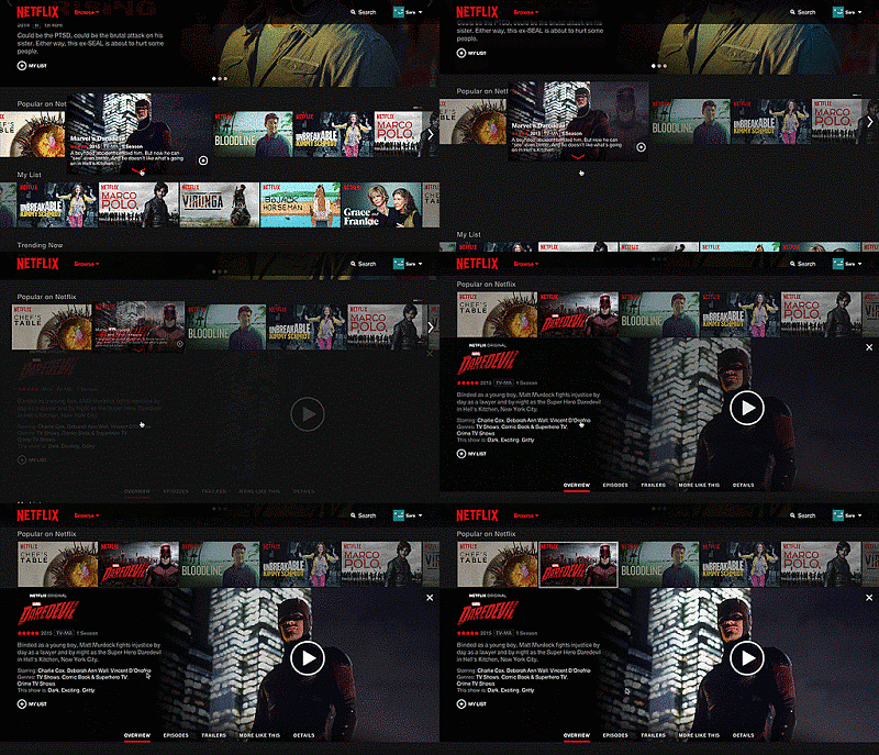
If you're using a device that has touch-screen capabilities, you can use taps and swipes to play something or to scroll. And if you noticed from the images above, Netflix is now on a black background and each movie or show has received a widescreen image instead of the vertical ones.
All these new features launch today and will take two weeks to arrive on everyone's Netflix account. Maybe now when we get together with friends to watch a movie, it won't take two hours to pick something — it'll just take one hover.