Sephora Pantone Color of the Year 2016
How to Wear Sephora x Pantone's Pastel Colors No Matter Your Skin Tone

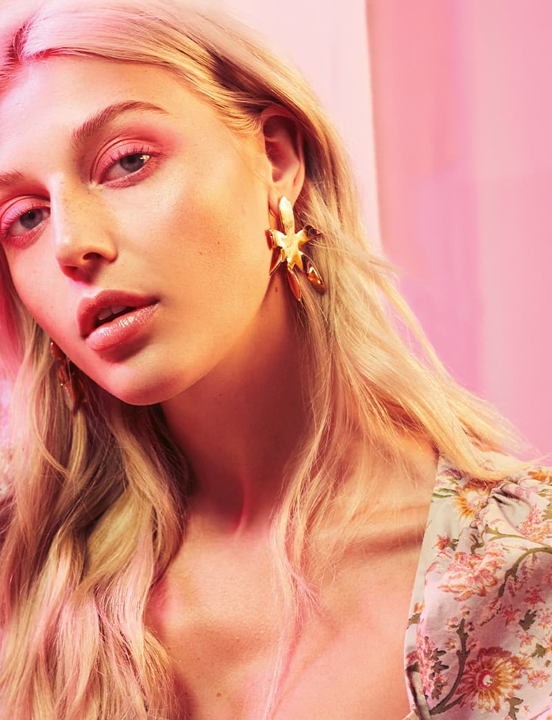
In the wonderful world of beauty, we often think of ourselves as artists, painting our faces (hopefully coloring within the lines). And that means we need a fantastic palette of shades to get the job done. Each year Pantone releases its official Color of the Year (past winners have been emerald green and marsala wine), and then the Gods pros over at Sephora create products featuring said "it" hue. Today, we are elated to reveal that we have an exclusive first look at the 2016 Pantone Universe x Sephora offering featuring the two chosen ones: Rose Quartz (powder pink) and Serenity (pale sky blue).
"We worked hard to make sure everything appeared true-to-tone on every skin tone so they look great on every complexion," Sephora pro Helen Phillips told us. "When paired together, they bring to mind springtime and new beginnings, and I just love a good pastel." (Who doesn't?!)
Part of why Pantone choose these shades is for their soothing qualities. "Think of a trip to the beach under a calm Serenity blue sky that seems to go on forever," said Leatrice Eiseman, the executive director of the Pantone Color Institute. "It seems weightless and airy imbuing a sense you with the same care free feelings. Rose is a color that is almost always associated with a gentle, tactile touch. At the same time its warmth draws you in, so it is seen as compassionate and caring. There is also a healthy glow that is attached to the color. Together, they are perceived as soothing."
But perhaps what warms our hearts the most here at POPSUGAR Beauty is how forward-thinking this choice was. "We are experiencing a gender blur as it relates to fashion, which has in turn impacted color trends throughout all other areas of design, opening our eyes to different approaches to color usage," said Eiseman. "There is a certain 'fluidity' to the color combination as they are balanced tones of both warm and cool qualities. These are qualities that are recognized by both men and women as both sexes are embracing the combination more readily. It also speaks to a generation that is less concerned about the stereotypical view of color and applying them with a new and more open approach."
To celebrate this visionary and visual shades, Sephora is releasing a multitude of makeup must haves. There's the Rose Quartz Layer Lipstick ($18), which can be used to DIY an on-trend ombré effect. A matte lipstick in Serenity ($18) has a satin finish, allowing you to rock an Ice Queen lip look.
Then, there are Modern Watercolors sets of six lip glosses ($28) and 24 eye-shadow shades in a mega palette ($39). These kits include other hues to pair the pastel pink and blues with. Everything launches later this month at Sephora.
Helen weighed in how this array of hues work together: "Neutrals like greige can accentuate the softness of Serenity and Rose Quartz," she explained. "It complements both tones and can add depth as a crease color. Monochromatic looks with pinks and blues can also add depth and be a fun party look. Try Rose Quartz with a bright pink as a crease color or Serenity with navy to bring dimension." Or, she advised to just add simple black eyeliner for a sophisticated, classic style.
Since we know you can't wait to start creating custom looks and combinations with these fresh colors, we quizzed Helen on how to wear it for every skin tone. Keep reading to score some seriously awesome beauty advice!
![How to Wear Rose Quartz on Multiple Complexions:
Light: “Rose Quartz can be trickiest on lighter skin tones because it is a color that occurs naturally in the skin,” Helen said. “I recommend wearing the shade on your cheeks, and the Rose Quartz shade from the Modern Watercolors Eye Palette doubles as a flattering blush. If you have more of a golden undertone, you can apply it on the eyes, and pair it with a cat eye for a classic look.”
Medium: “It is surprisingly easy to wear if you have a medium skin tone because you generally have more olive, or gold undertones, which contrast with any pink tones in the skin,” she explained. “For someone with a medium skin tone, Rose Quartz is a very flattering shade for the lips. I like to apply the Layer Lipstick, and then add dimension to the outside by using a slightly deeper lip liner or a lighter gloss from the Modern Watercolors Set in the center of the lip for an ombré effect.”
Deep: “The shade can appear bold on a deep skin tone, so pair it with complementary shades to make it the right amount of sweet,” Helen noted. “Pastel eyeshadows typically don’t show up true to tone on a deeper skin tone, but when we designed the Modern Watercolors Eye Palette, we kept this in mind and tested them out on a variety of deeper skin tones. I create a chic monochromatic look with matching eyes and cheeks to give a doll-like [style].”](https://media1.popsugar-assets.com/files/thumbor/rnA_yQf9YdboQOhwpjpT65_uZNc/fit-in/1024x1024/filters:format_auto-!!-:strip_icc-!!-/2015/12/01/941/n/1922153/01fa09fa33bb3a2f_COY_Lipstick_1_/i/How-Wear-Rose-Quartz-Multiple-ComplexionsLight-Rose-Quartz.jpg "How to Wear Rose Quartz on Multiple Complexions:
Light: “Rose Quartz can be trickiest on lighter skin tones because it is a color that occurs naturally in the skin,” Helen said. “I recommend wearing the shade on your cheeks, and the Rose Quartz shade from the Modern Watercolors Eye Palette doubles as a flattering blush. If you have more of a golden undertone, you can apply it on the eyes, and pair it with a cat eye for a classic look.”
Medium: “It is surprisingly easy to wear if you have a medium skin tone because you generally have more olive, or gold undertones, which contrast with any pink tones in the skin,” she explained. “For someone with a medium skin tone, Rose Quartz is a very flattering shade for the lips. I like to apply the Layer Lipstick, and then add dimension to the outside by using a slightly deeper lip liner or a lighter gloss from the Modern Watercolors Set in the center of the lip for an ombré effect.”
Deep: “The shade can appear bold on a deep skin tone, so pair it with complementary shades to make it the right amount of sweet,” Helen noted. “Pastel eyeshadows typically don’t show up true to tone on a deeper skin tone, but when we designed the Modern Watercolors Eye Palette, we kept this in mind and tested them out on a variety of deeper skin tones. I create a chic monochromatic look with matching eyes and cheeks to give a doll-like [style].”")