Professional decorators make the art of arranging a room look easy. But anyone who has ever tried to style a nook or a vignette in their living space, dining room, or bedroom knows how much thought, planning, and sweat goes into making a room look perfect.
Fortunately, though, we can learn from those in the know. The skills of some of America's top designers were on display at the 2015 Kip's Bay Decorator Show House, with talents including Thom Filicia, Alessandra Branca, David Phoenix, and Cathy Kincaid showing 13 perfect, easy ways to style a residence.
1Mix Metallics and Color
Image Source: Rafael Quirindongo
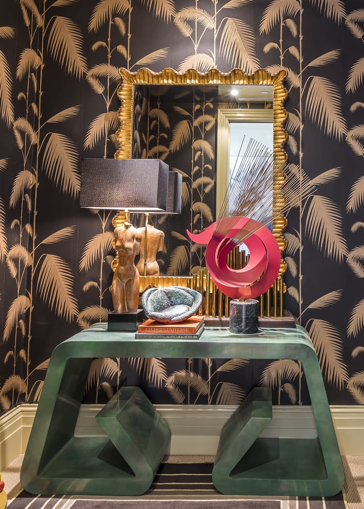
Designer Michael Herold wasn't afraid to play with color and tone. He arranged a three-part vignette atop a console table that mixed a color, a geometric sculpture, and metallics in the form of an scalloped mirror, all to dramatic effect.
1 / 13
2Embrace Symmetry
Image Source: Rafael Quirindongo
Alessandra Branca of the Manhattan design firm Branca gave a master course when it came to the perfectly arranged wall. She selected a set of four paintings from the artist Veronique Gambier and confidently hung them in a symmetrical pattern in a room full of competing, contrasting, but ultimately harmonious patterns and colors.
2 / 13
3Lighten the Mood With Books
Image Source: Rafael Quirindongo
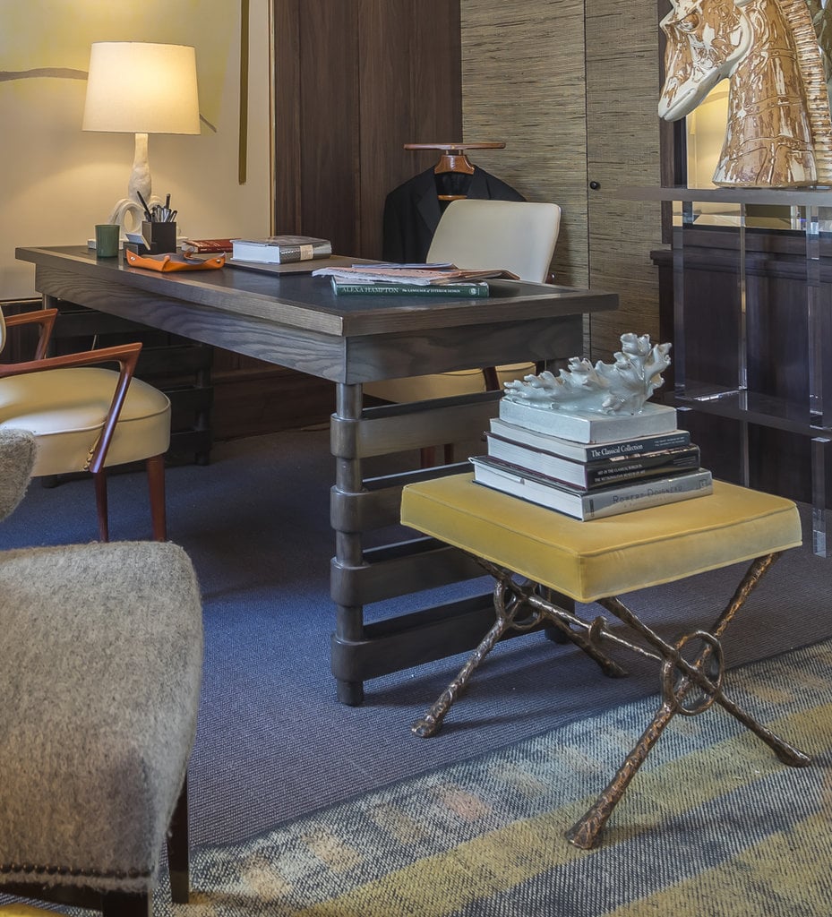
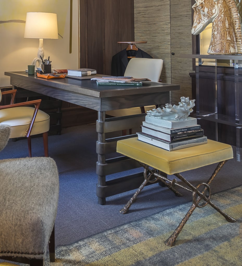
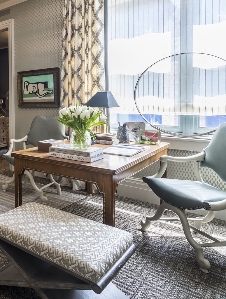
Alan Tanksley outfitted a study with a decidedly masculine vibe. The books displayed throughout the space, though, read as neither particularly masculine or feminine. Instead, he brought weight to a light-colored bench by stacking books and a piece of coral art together for a highbrow but playful vibe.
3 / 13
4Add an Eye-Catching Element
Image Source: Rafael Quirindongo
When decorating a study, Thom Filicia gave extra thought to the area surrounding his centerpiece desk. He chose to avert one's gaze from the desk itself toward the circular artwork perched on the windowsill. The effect of the inspiring element is to expand the area around the desk and draw the eye upward toward the ceiling.
4 / 13
5Wholeheartedly Embrace a Style
Image Source: POPSUGAR Photography / Emily Bolles

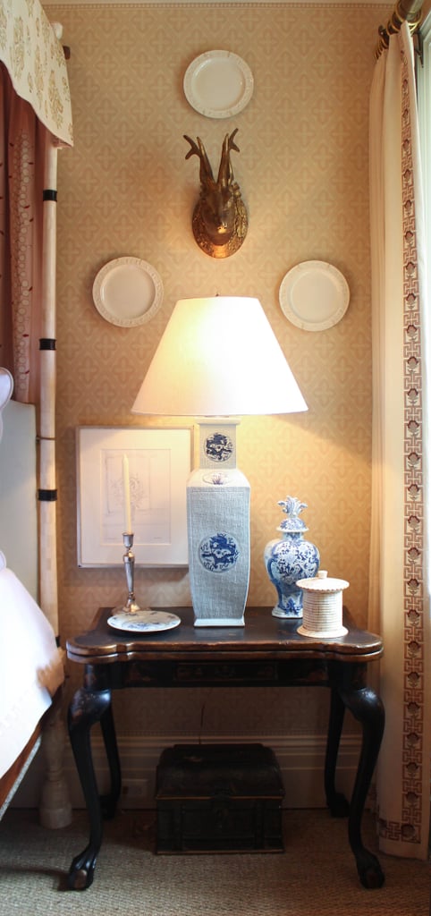
Texas-based decorator Cathy Kincaid was all about the tried-and-true in her space, a bedroom. She proved that fully embracing a style can be perfect when done properly by mixing a number of blue and white pieces from John Rosselli Antiques & Decorations with mounted plates and a candlestick, achieving a comprehensive vintage look that nonetheless feels clean and chic today.
5 / 13
6Add a Mirror
Image Source: POPSUGAR Photography / Emily Bolles

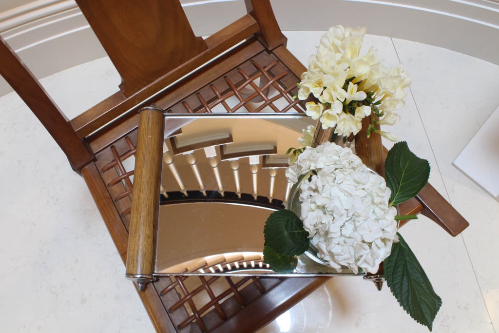
Good style doesn't always involve an excess of items. Designer Ronald J. Bricke proved the rule in his entryway by simply placing flowers atop a mirror, amplifying the bloom's beauty.
6 / 13
7Say Yes to Opulence
Image Source: Rafael Quirindongo
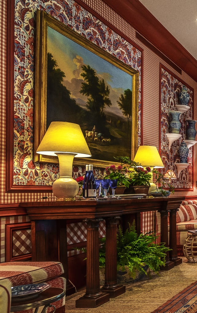
Learn to love the saying "more is more." In the cast of designer Mark D. Sikes, adding decoration upon decoration — in this case, flowers, lamps, glassware, and paintings — is a very good thing.
7 / 13
8Make Your Bar a Focal Point
Image Source: Rafael Quirindongo
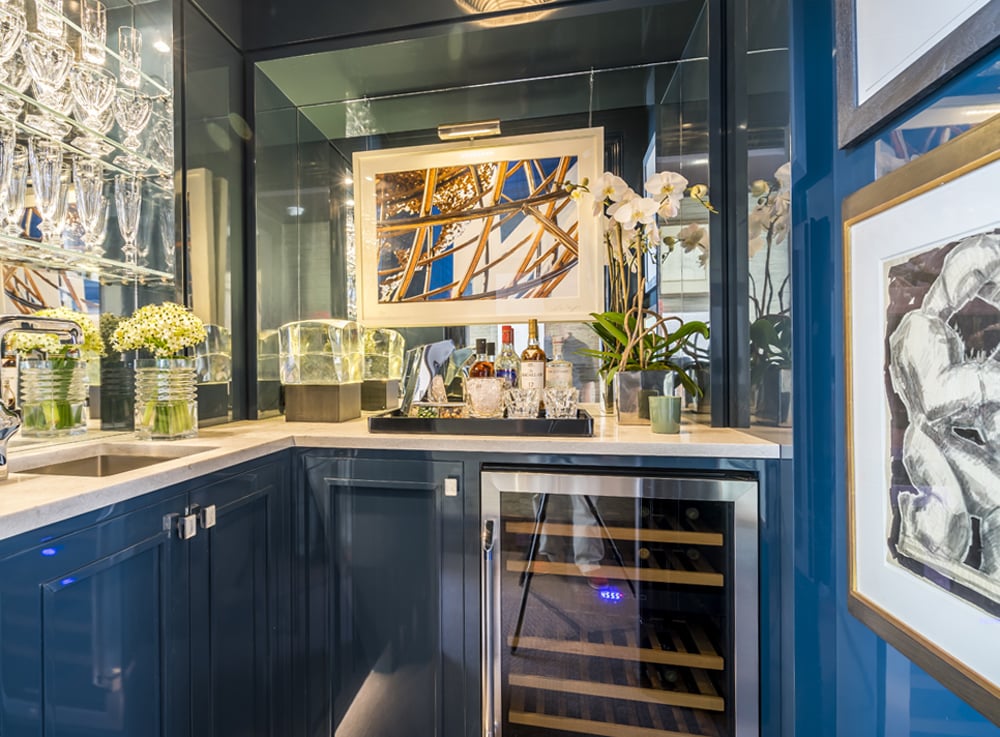
Alan Tanksley turned a closet into a very special bar area, maximizing the small space through sheer opulence. He paired lacquer cabinets with a Dacor wine refrigerator and luxe Baccarat glasses and barware.
8 / 13
9Mix Like With Like
Image Source: POPSUGAR Photography / Emily Bolles
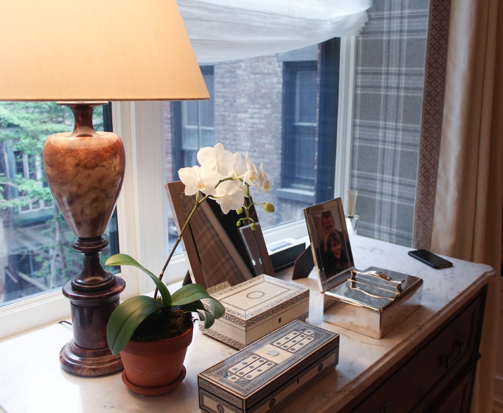
In David Phoenix's bedroom space, he outfitted the top of a dresser with a variety of boxes. The repetition formed a cohesive look, especially when paired with a plant and a lamp.
9 / 13
10Play With Height
Image Source: POPSUGAR Photography / Emily Bolles
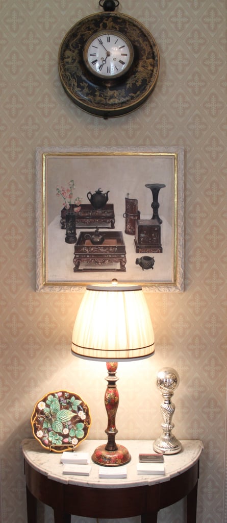
Cathy Kincaid's bedroom was also a study in the expert use of wall hangings to add loftiness to an otherwise standard space. Her vignettes were all built up toward the ceiling, stacking paintings and clocks above lamps and side tables to create the illusion of height where it was otherwise lacking.
10 / 13
11Embrace the Rule of Three
Image Source: POPSUGAR Photography / Emily Bolles
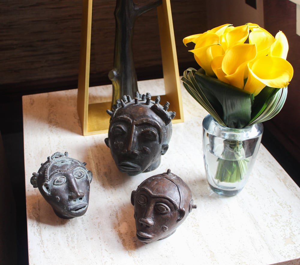
Alan Tanksley's study featured numerous vignettes, including one end table decorated with three small figurines. The design emphasized the well-known design principle of the "rule of three," in which compositions divided into thirds, generally speaking, are the most interesting.
11 / 13
12Stick to a One-Color Palette
Image Source: Rafael Quirindongo
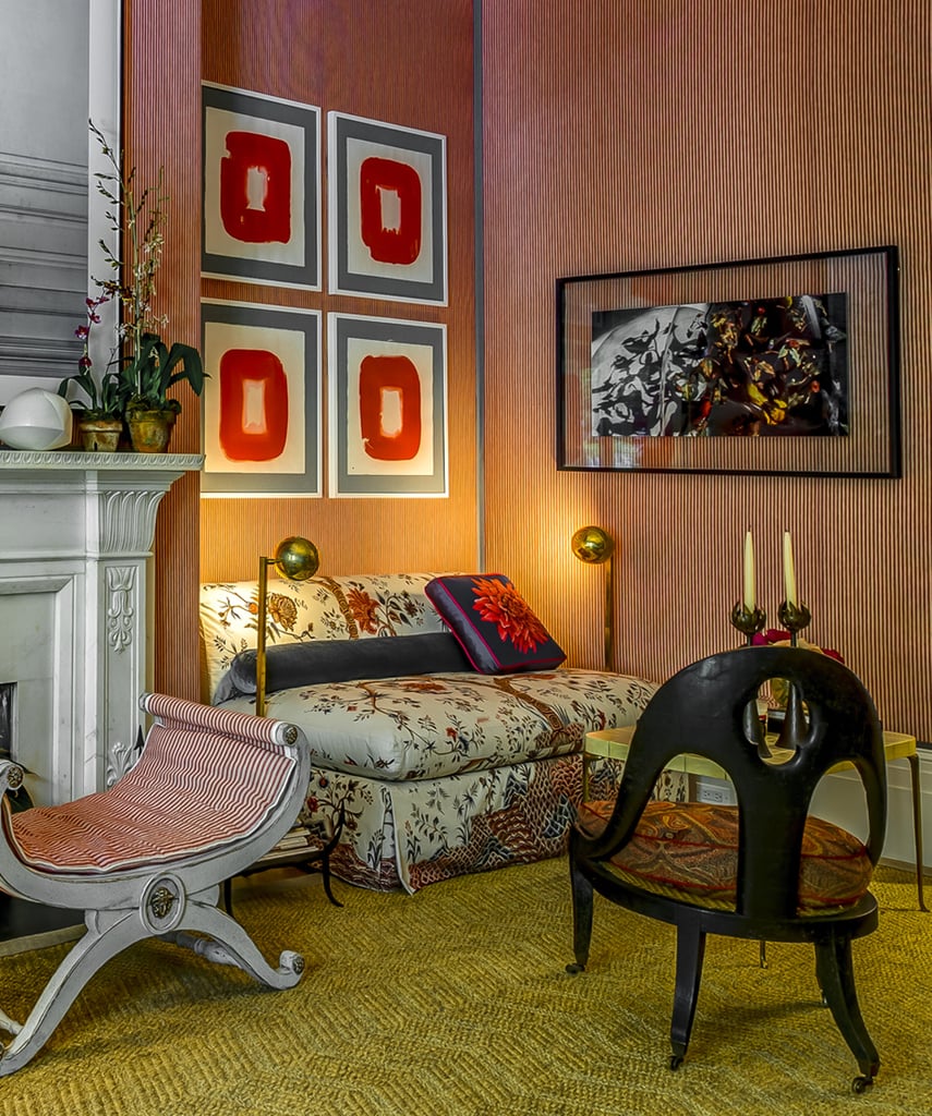
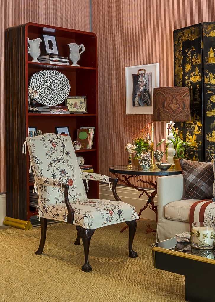
Alessandra Branca found a color she loved — red — and ran with the theme. She employed the hue via wallpaper, a bookcase, and on accents throughout her sitting room. By choosing only one bright color, she was able to tie together a space full of disparate elements.
12 / 13
13Cover Your Books
Image Source: POPSUGAR Photography / Emily Bolles
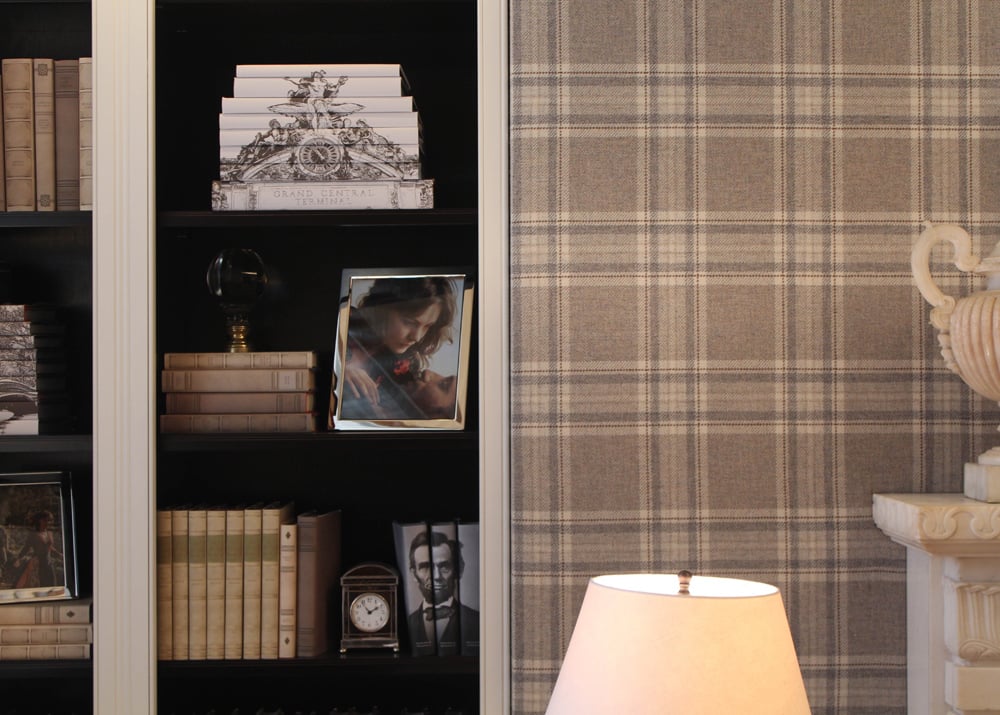
Designer David Phoenix's finishing touch was styling a shelf with matching, covered books. He achieved the pulled-together look with the help of Juniper Books.